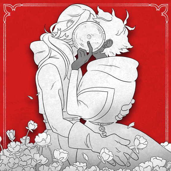
In a monastery where revealing one's face is an affront to the god housed inside its very chambers, what happens when one young man accidentally sees the face of another?
In March of this year, my partner Spire and I held an exhibition at a local comic shop La Belle Adventure with a breakdown of our process behind Ruin of the House of the Divine Visage. To celebrate Webcomic Day this year, I thought I would compile everything we put on display. Click each image to see a bigger version.
Haven't read Ruin yet? This breakdown will contain some spoilers, but you can read the webcomic for free and buy the completed comic if you like!
Ruin of the House of the Divine Visage is a 130-page graphic novel, co-created by Eve (that's me!) and Spire Greenwood, exploring a relationship with religion and queer identity. We started working on the concept for the story back in 2020, and crowdfunded a printrun of the completed graphic novel in August 2024, along with a launch for the webcomic, which is currently ongoing.
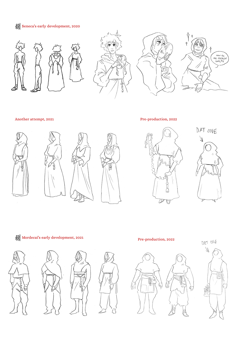
The characters' outfits were originally inspired by medieval beekeepers, who wore robes with a wicker mask to protect themselves. We knew Seneca and Mordecai had to have completely different outfits because of their jobs, but it was also important to build clear silhouettes and shapes to differentiate them without being able to see their faces. All their personality would be shown through their clothes and acting, so their designs had to be perfect. Spire was tweaking them right up until drawing the first pages!
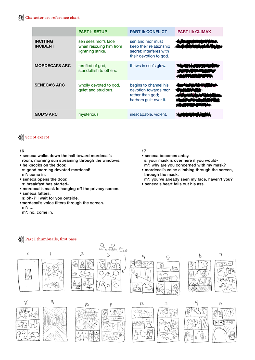
We collaborated on the script, each with a shared document open on our computers and discussing as we typed. We have been writing together for a long time (check out some of our other collaborative projects here) and that means our scripts don't need to be overly detailed; Spire can envision what Eve describes, and Eve trusts Spire to take a description and bring it to life. Each bulletpoint in our script was a separate panel, with just enough necessary information.
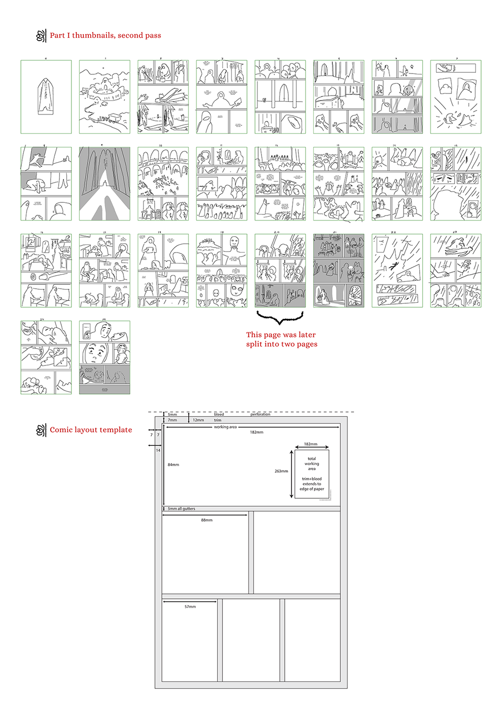
We also thumbnailed together, as we are both comic artists and visual thinkers. "Thumbnailing" is the planning stage where you lay out what each page looks like.
Once the scrappy thumbnails were finished, Spire would go back in and refine them himself into clearer thumbnails to reference while he sketched the pages. We didn't stick 100% to the script; if we felt a page needed an extra panel, or a scene needed an extra page, we added it. Sometimes it's hard to judge pacing by script alone.
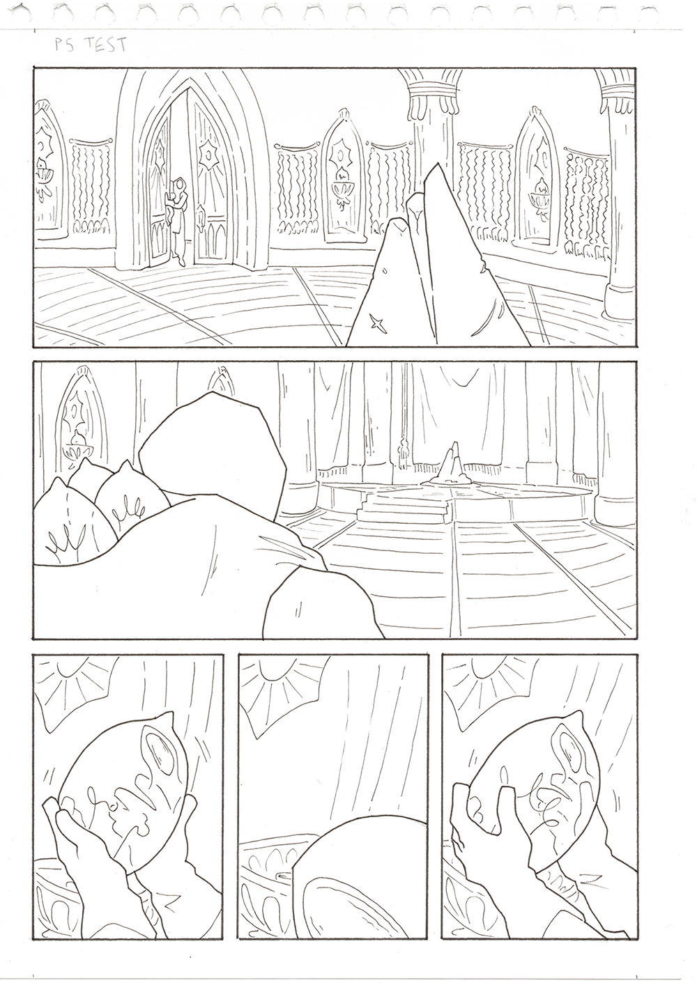
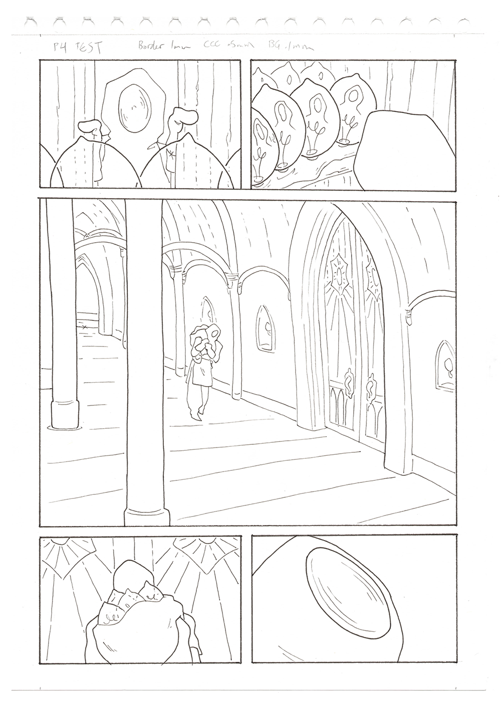
Before starting the full graphic novel, Spire did some test pages to figure out what the comic would look like. We decided on a stark greyscale style for this story, with simple shapes and restrained but confident linework. You can compare the above test pages to the finished pages below as they appear in the book - we zoomed out to make the Divine Chambers feel grander, and Spire refined Mordecai's silhouette to be more recognisable. What other differences can you notice?
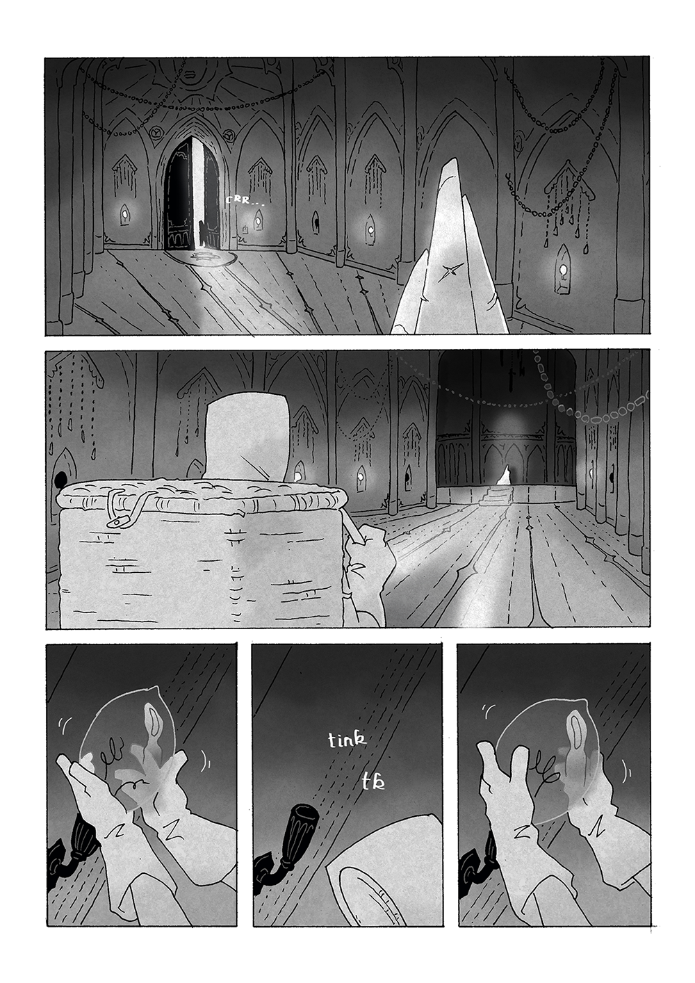
Every single page of the comic was inked traditionally on A4 paper with a 0.1 Micron. The book itself is only A5 - that's half an A4 sheet of paper - but drawing it bigger than it needs to be meant that Spire could add plenty of detail where necessary. Each page was then scanned in before being digitally shaded and passed to Eve to be lettered. "Lettering" is where the text and speech bubbles are added to the page.
Some of our favourite pages ended up being those with no lettering. This second page was actually part of a sequence that was not originally in the script. Spire showed Eve some doodles he had done at work and we immediately decided we needed to include this imagery.
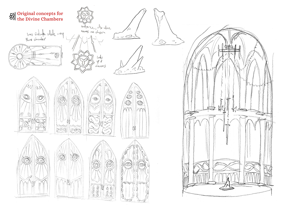
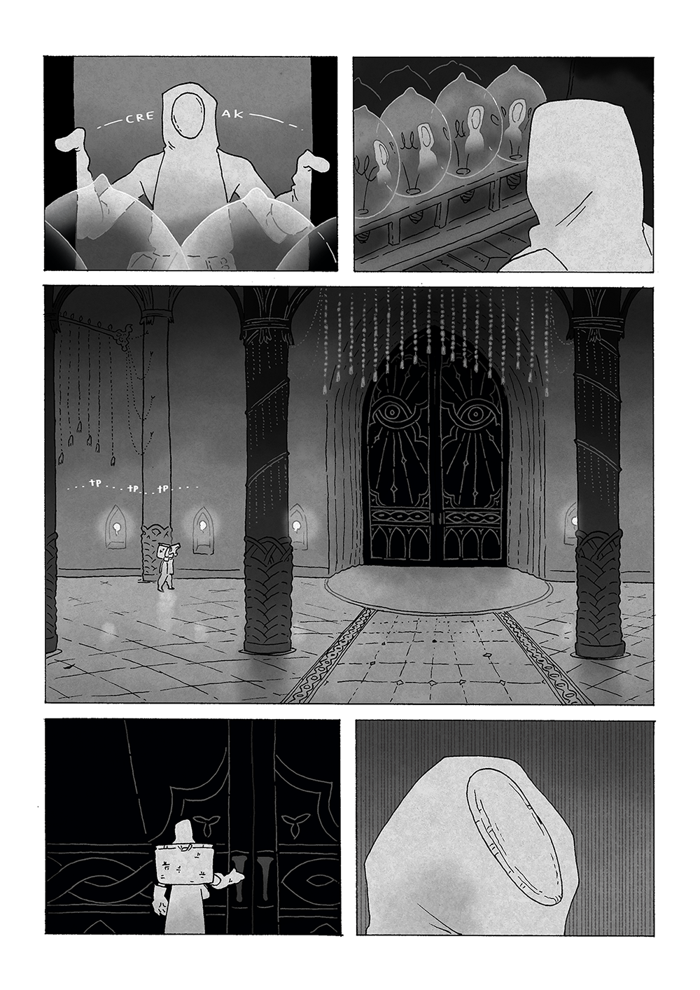
The doors to God's chambers are just as important as the look of the hall itself. Spire went through many interactions before landing on the final simple yet striking door design. The cavernous interior is accentuated by God's msyterious plinth and the weapons that dangle above it. The weapons are meant to evoke a sense of history, without necessarily betraying what that history might entail.
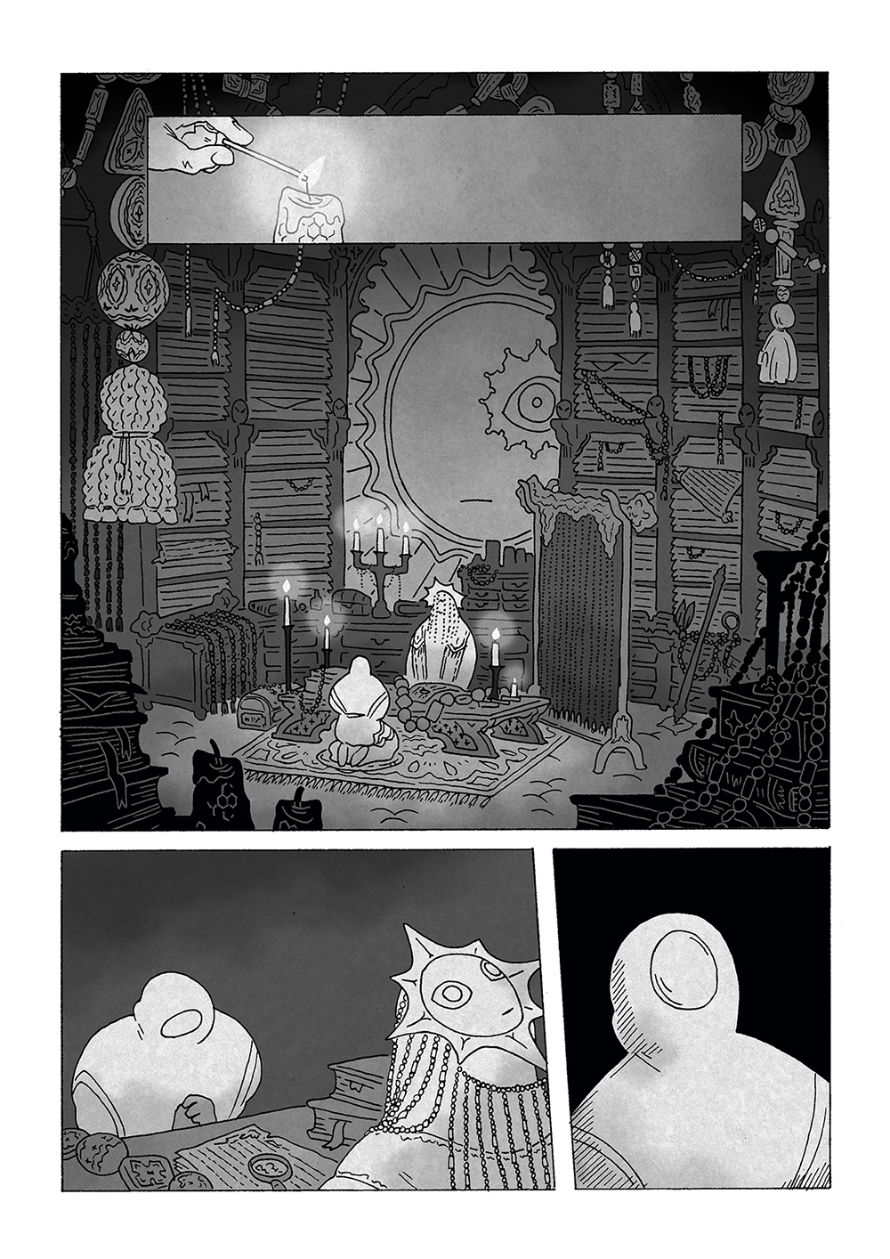
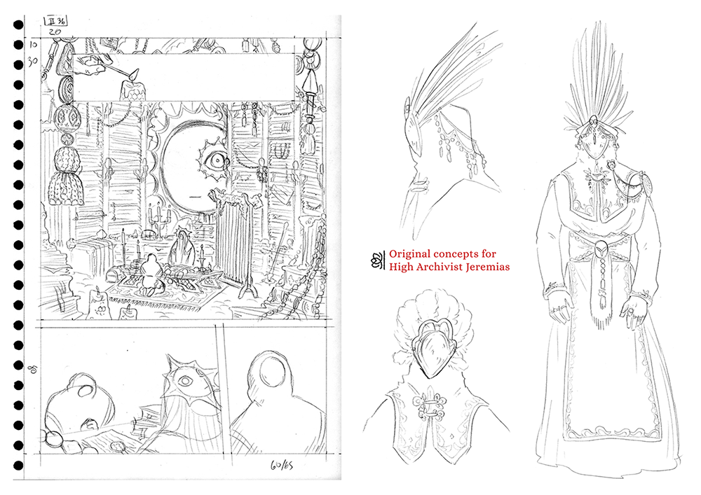
The High Archivist's office is crammed full of hundreds of years' worth of texts and records. Each of the Ordinants have their own title, though only High Archivist Jerimias and High Ordinant Venera are named in the final book and the High Physician is briefly mentioned. There is also the High Artificer (who oversees Mordecai and the other workmen), the High Matron, and the High Constable. Each of the Ordinants wears the face of God somewhere on their outfit.
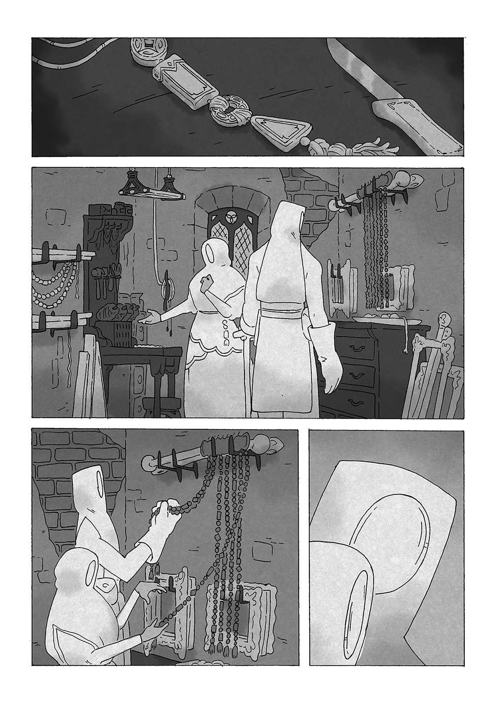
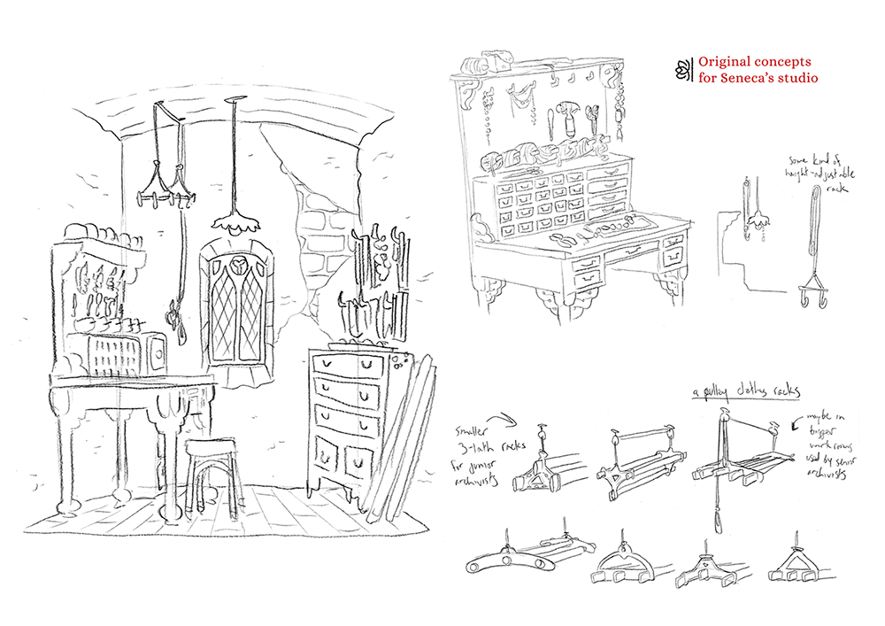
Seneca spends most of his time in his workshop. It had to feel busy but well-kept; Seneca keeps all of his supplies in order and takes his job very seriously. We wanted to make sure the reader became familiar with Seneca's workshop, so a lot of thought went into how it would be organised and what sort of tools he would need to create the divine texts that appear throughout the book. We based one of his tools on the pulley clothes racks that you see in a lot of older Edinburgh flats!
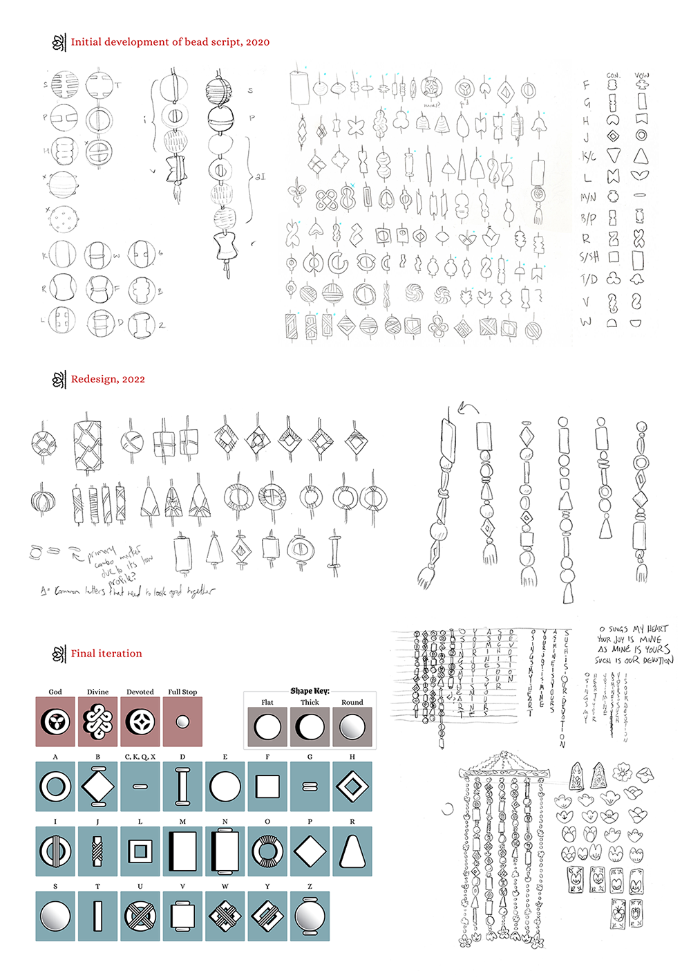
The House of the Divine Visage records its sacred texts with a "writing" system that uses beads of different shapes. This writing system went through a lot of development, starting off with wicker knots and wooden symbols and slowly evolving into the carved bead system that appears in the book.
An early version of the writing system was much more difficult to read, based on a shorthand typing system called stenography, to highight the fact that this writing system would be difficult and obtuse for in-world newcomers to learn. Over time we simplified the writing system to be an almost direct one-to-one cypher for the English alphabet. Any recognisable beads you see in the comic are fully readable if you know how. You can read more about the development of the system here!
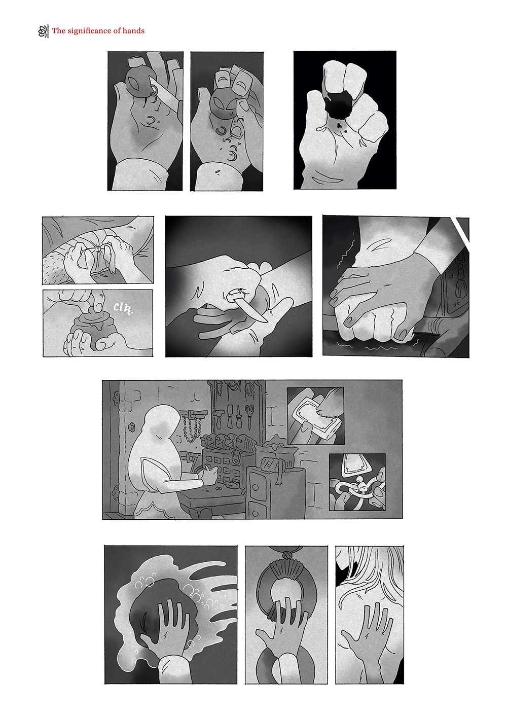
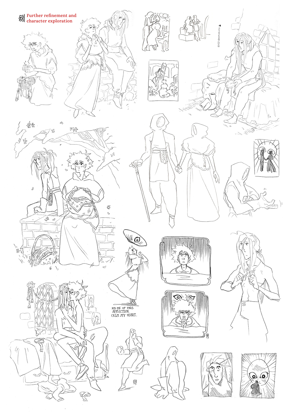
For the most part, the characters' hands are the only exposed body parts that we see throughout the comic, so they do a lot of character acting. Hands are a great tool for communicating not only an emotion, but the very relationship between the characters as well. They carry more weight still: Spire took care to spend time showing characters working at their craft. The thought here was to emphasise that everything in the world of Ruin - clothes, baskets, the House itself - were all built and maintained by human hands.
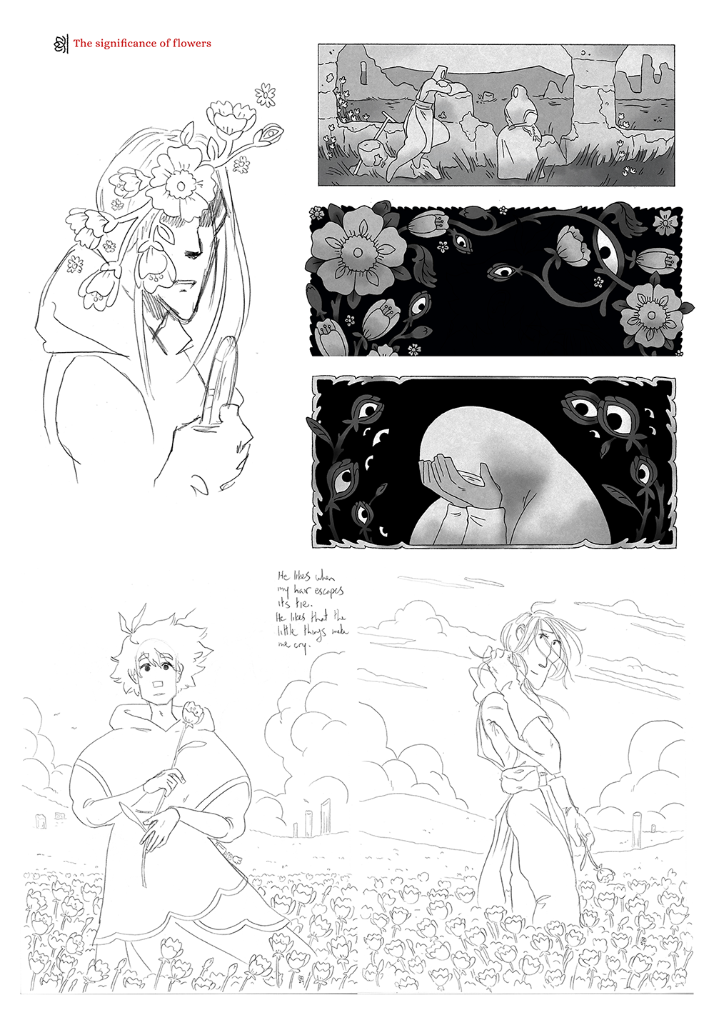
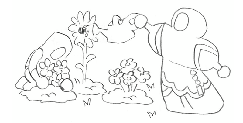
Flowers play a significant role as well. Any scrap of time that Seneca and Mordecai spend outside of the House is often peppered with little white flowers These looms are based on the buttercup, which supposedly represents freedom. But the ache for freedom goes hand-in-hand with guilt. The flowers are often entwined with the needling presence of God's watchful eye.
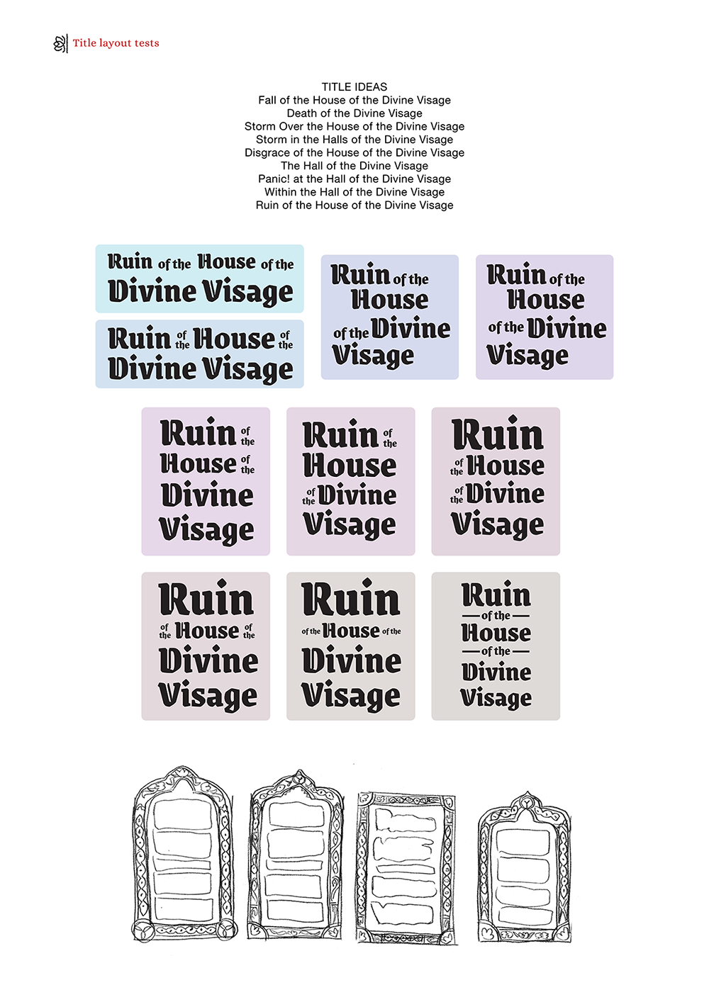
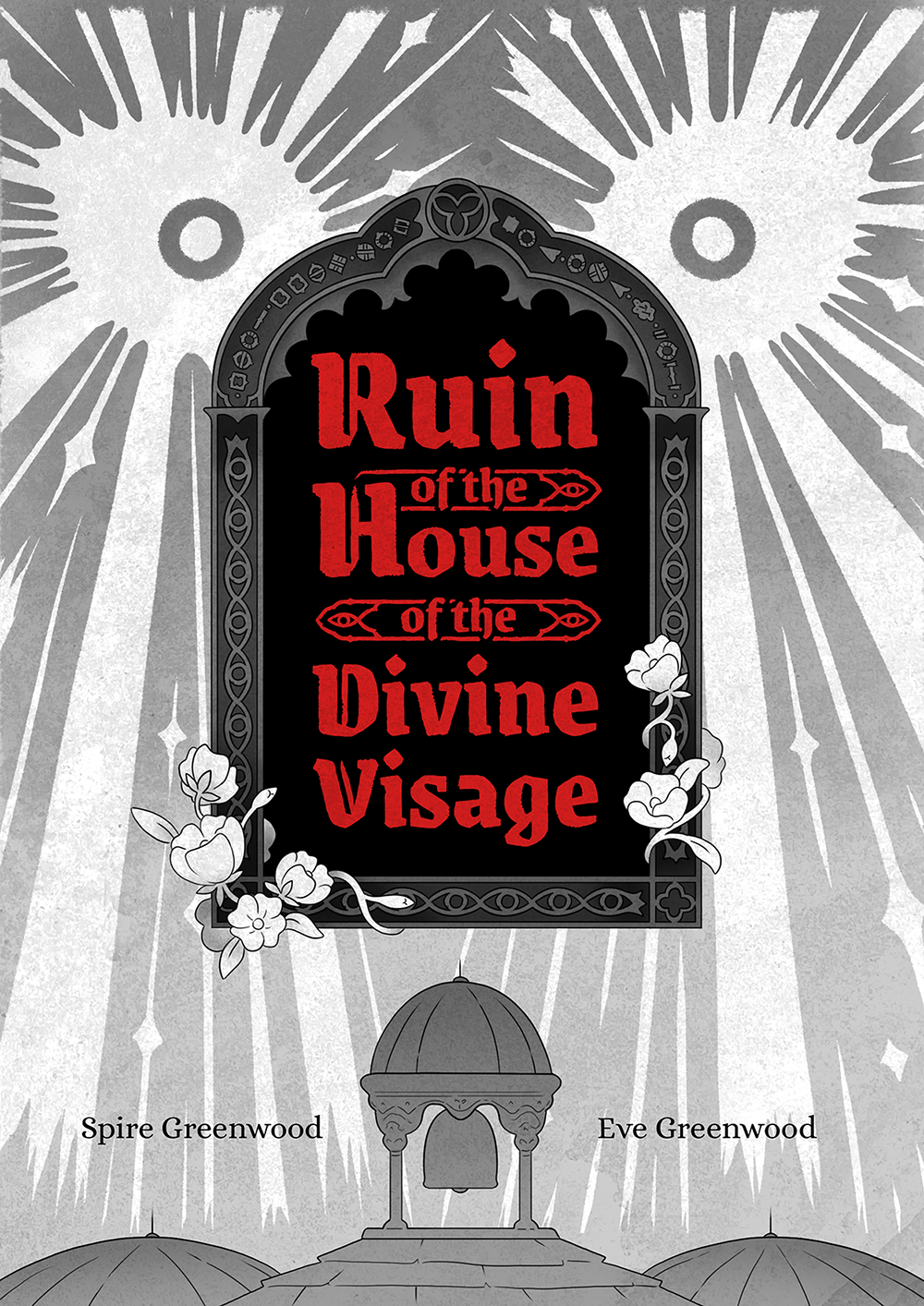
When naming this comic, we wanted the length of the title to evoke the sort of time period it is based in. The main concern for composing the title was how to handle the double 'of the's. Their presence needed to be minimal but legible.
The completely vertical format turned out to be the best layout, and also felt more in line with the feel of the comic; the logo towers up much like how the Divine House towers over the people who live in it.
It's important to strike the right balance of detail and readability when designing a logo. Spire had to design the title to work in big sizes, like on the book cover, and small sizes, like on the web. The words in the title lock together into one rock-solid slab; this helps break the repetitive nature of the title and makes it look like one cohesive unit.
Thank you for reading! If you'd like to keep up with Ruin webcomic updates, you can follow any of these links: RSS, Bluesky, Tumblr. You can read the webcomic for free here and buy the completed comic in print or PDF here. Happy Webcomic Day!